Finally getting on with it
After something of a hiatus, my epic-tome is finally moving forward again. My adventures in Tasmania have left me renewed, refreshed and only somewhat exhausted – but ready to focus on the final stages of production.
Since my plan is now to try self-publishing the tome as an eBook, there are a few hoops I need to jump through to get to launch point. First of these is to make some tough decisions about the cover design.
Given the number of eBooks in the market place, I feel that my cover image will need to be really eye-catching. This will (hopefully) get potential buyers to pause for long enough to become actual buyers. This sounds easy in concept but, for a first-timer in particular, it’s a little less so in implementation.
As is my way, I’ve spent an awful lot of time on the research phase, looking at book covers, both in book stores and online. Whilst there seem to be just about as many different styles as there are books, only a fairly narrow range of these appealed to me and this had led me to the following conclusions:
- there really isn’t enough space on a cover for more than a single image, the title and the author’s name
- there needs to be a reasonably clear link between the cover image and the title – otherwise the potential reader is likely to move on to something less challenging/confusing (I certainly do)
- the image needs to ‘pop’ as a thumbnail, to be sufficiently clear and eye-catching as to attract attention
- the font selection needs big enough and clear. Crisp lines seem to work better, overall.
- likewise, the cover needs to be one that can look good in colour (if used) and also in greyscale.
No pres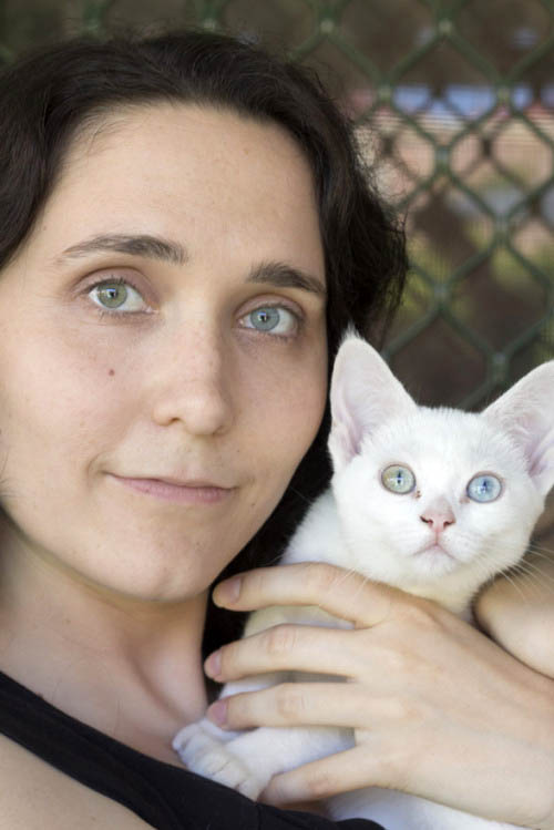 sure, really…
Luckily it’s the end of the convention season, which meant that the creative talents of Lisa Rye have become available – much to my delight. Based on discussions over lunch at our first business meeting, she roughed out seven thumbnails and emailed them through for me to look through while I was in Tasmania. Super efficient.
Suddenly the tome has taken on a whole new dimension – it looks like a real book!
Choosing which image to run with took me much longer than expected, which is amusing since I ended up choosing the one I’d liked best when I first saw them! Lisa is currently developing the concept and I can’t wait to see what she comes up with. Watch this space for the grand reveal soon…
Of course, once a potential buyer has paused for long enough to admire the cover they need to find the text engaging as well. To this end, editi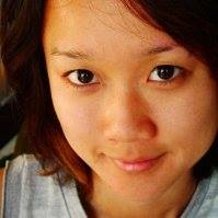 ng is all-important. I had the manuscript professionally assessed over a year ago and have had feedback from a number of beta readers since then, resulting in a number of minor revisions for clarity or consistency.
I think I’m on the home stretch now, with the help of talented writer/artist Sandy Lim. It’s been very interesting to have a fresh set of eyes on the manuscript. Sandy’s careful, professional editing and comments – some of which also reached me on holiday (!) – are proving to be most insightful and will result in a tighter, more readable product. No wonder she’s in demand 🙂
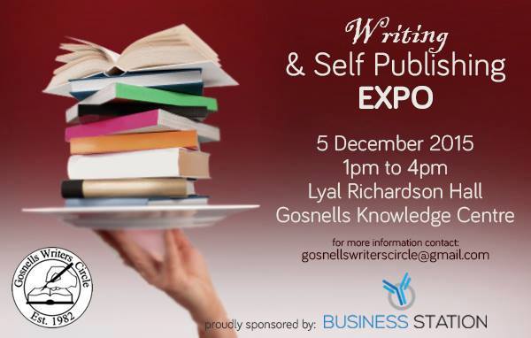
With all of this in mind, I’m off to a half-day self-publishing expo this coming Saturday. I’m hopeful that some gem(s) of information/insight will be forthcoming to push the process along. Maybe I’ll see you there…
Can’t wait to read it 🙂